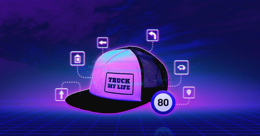
My summer at Ackee was all about a mobile application for one of the biggest logistics company. In a nutshell: a big company, large stores, storekeepers, trucks, drivers, pallets and all the rest that comes to your minds when thinking of transport. Not excluding the massive amount of administration, of course. Drivers obviously love the administrative work, because after driving, loading the goods, sending messages with codes, waiting in traffic jams, finding a parking space in the center of Prague (which also includes fighting over it with another driver) and finally unloading the truck, there is nothing more enjoyable than using the remaining time to do the paperwork. If this sounds like a sarcasm to you, you are right. A truck driver’s job is very hard and stressful, even without the paperwork and the duty of putting all the details down one by one.
These days, electronization is a common trend that has also struck these drivers. The purpose of the application that was meant to be created was to help drivers with the administration and to help bosses improve management and the collection of data.
Let’s design the perfect app for drivers. Ok, but truck drivers; these guys in flannel shirts and caps, who don’t really take up with IT, is it them? That’s how my thoughts went.
Truck life
To find out who these guys really are we had to join them in their vans and see how their ordinary day goes. Observation as a method of user research is quite a common technique used to read the behaviour of the target group in its natural surroundings. Even though it can be quite a time consuming method, it is worth trying.
If you see the actual working day, it brings you many insights. Eventually, you find out how they manage their jobs, what tools they use and can examine their mood and emotions while performing concrete actions. You can capture many details that you wouldn’t even have noticed in a classic interview. Our automatic, subconscious behavior while at work is hard to describe in an interview. The great advantage of a first hand observation is also the possibility of posing questions of why and how they do particular things and how they think the app could help tm.
We mainly focused on the sequences of steps taken by the drivers, how they work manually and when they do the paperwork. As we found out during our Prague ride, the driver needs to multitask a lot. Loading the goods, driving the vehicle, unloading the trucks and putting these steps down on the paper; that’s how they roll.
What have we found out?
Drivers don’t wear flannel shirts or caps, and they really don’t like IT. They mostly don’t stick with the standard procedures given to them by their bosses. They have their own know-hows that make their lives easier. Some of them don’t even have a smartphone and if they have one, they use it as a normal phone, not an overblown, vital necessity full of Instagrams, Snapchats, notifications, gifs, likes and posts.
We found out that we need to come up with a complex app containing a lot of administrative content that is formally really easy to use even for people who are not used to smartphones or who are familiar only with their basic functions.
The aim is to automatize the basic processes that could have been automatized like that and to design an app with minimum interaction and the easiest possible navigation.
Just to summarize; we were creating an app asking users who couldn’t use a smartphone to upload data about loading, unexpected situations on the road, unloading, refuelling, reclamations, exchanges of pallets etc.
Easy-peasy.
Back to the office
One day in a van is enough. Really. Now I know, that I don’t want to become a driver and what’s more, I know how a day in the driver’s skin feels like and it’s no piece of cake. Ok, I would rather design wireframes. Which is in fact my next step together with prototype usage testing.
We needed to prepare detailed wireframes with understandable texts and navigation that would lead users where we needed them to go even in cases of users who had no idea what the app was and how it worked because they had never seen one before.
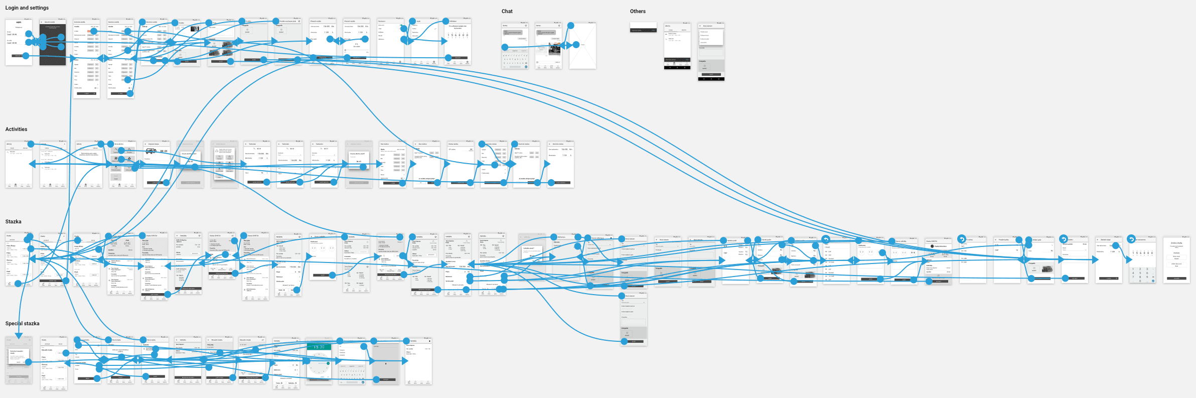
We wanted to test the clickable prototype created from wireframes on some users. For user testing, two other things are necessary besides the clickable prototypes – a screener and a script.
A screener is basically a description of respondents that are about to be tested. Ideally you want to test 6 respondents deferring in age, sex, experience, level of IT knowledge and other factors that are relevant for the certain group of users.
We were lucky to get 4 respondents. Drivers weren’t exactly the most committed target group, thus they didn’t really want to participate in the testing. However, they actually differed in age, years of experience and experience with smartphones.
The next important think is the script including every single step that the respondent must do during one run of a testing prototype. It is important to prepare model quests so that it has the same parameters as the real situation. In the script we wanted to do a re-make of their ordinary working day.
So the basic assignments were these:
- Taking the car
- Loading the goods
- Unloading the goods
- Exchanging pallets
- Terminating the stock
- Notifying an accident, including photo documentation (a chat-like tool)
Having our script, screener and prototype prepared, we ran the test.
The user testing
A regular testing is an easy process. You meet your respondents at your testing laboratory. The only thing you usually need is the prototype you’re working on; in this case a smartphone with a recording and testing software, testing script and an anchor, which gives the respondent assignments. In the observation room you want to have a person watching the live stream from the examination room and making notes of the testing process.
As a UX designer, I have quite a lot of experience with user testing in laboratory conditions as well as with respondents who use smartphones at least on the basic level.
However, testing for HOPI was a different story; a little hectic, with users who didn’t really fancy smartphones or didn’t even know how they worked. We didn’t run the tests in laboratories, we had to adapt and test our busy drivers in Hopi. The conditions were not ideal, but manageable. If you don’t have an observation room, it is the anchor’s duty to make notes, otherwise you can make the notes yourself while watching the recorded material.
I am used to various situations that can occur during testing, but if the respondent asks you what the application is and if it works on the basis of excel or word, you just figure out how deep the digital chasm can be and that a very hard day is about to begin.
“I wouldn’t use the app. I would just call the dispatcher.”
How did it all end?
It is hard to say. It surely didn’t go by the book. The expectations differed from the outcome, but we have to look at it from two different perspectives.
Users attitude and impressions
Negative. Respondents had no idea why they should use an app and they didn’t see how it could simplify their work. This denying attitude was a big obstacle during the testing process. The most common answer to everything was “I wouldn’t use the app, I would call the dispatcher.”
“Without computers the world worked better.”
Success
On the other hand, our users had no crucial problems using the application. After a few initial commentaries like “why do I have to do this?” or “without computers the world worked better,” they took the phone and finished their tasks. Of course in some cases the anchor’s assistance was needed, but this is quite common with prototypes that cannot simulate a real-life situation at 100%. Consequently, the success rate was surprisingly high.
Revelation
It isn’t easy to design an application for users who don’t want it because they cannot see its added value. Same as it isn’t easy to test it.
During the tests we realised that we didn’t need to change much because based on the results of our observation, we had found out that we needed to design it for users who were still learning how to use such a technology. However, we needed to incorporate a simplification of the navigation, lower the number of possible interactions and also make the buttons bigger with more clear descriptions. Sometimes it is not sufficient that a button looks like a button. If its label doesn’t show clearly what it is used for, our user could ignore it, which could cause problems.
Thanks to the testing process we were able to detect the significant details that needed to be edited so that we could improve the comperhensity and intelligibility of the app. Even the most experienced UX designer doesn’t know the answers to all of the questions. There is no instruction manual that would describe how to design an application. That is why it is crucial to test your prototype on a relevant user. If you don’t understand your target group, you simply cannot fulfil their needs and expectations.
Conclusion
If I said that Hopi is an easy-to-use application that can be understood and used by anyone, it would be a lie. It wasn’t possible to make it easy-to-use due to the clients needs. Users need to be trained to use not only our app, but a smartphone itself. It will take a while before they get used to it and find the added value of it.
Drivers’ requirements are hard. Their job is hard. Thanks to our observation and testing we created an app that will definitely simplify and speed up their work. Now it is their turn. They just need to believe in it and I am sure they will.