Redesigns launch countless waves of hate. That's an axiom. Every logo change of any more or less known company is welcomed by tons of bitter posts and comments on every social network of the world. Insults on designers, supposedly “witty” memes, attempts to improve the design, listings of human organs that can be seen in new graphics, discoveries of old-time logos from which the new one was obviously copied – just classic. The quality of the redesign doesn't matter. Twitter will explode even when Spotify changes the shade of green.
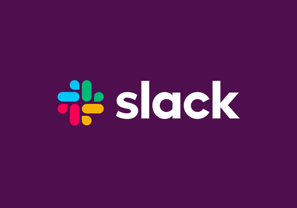
Of course, we have seen all of it this time as well. But the Slack management has known the internet for a while now. And they've prepared themselves well. Unlike many other companies they did not just issue a press release about the fact that they have a new logo from another top-tier superstar design studio (it seems that grown up startups are just convinced that a logo made in London or New York is a guaranteed win). They have published a blog post, explaining in detail why Slack blatantly needed a change. And those reasons (or at least some of them) actually make sense. In the last days, Slack has also been quite active on the social media: they tried to respond good-heartedly and humorously to the criticism, share their explanatory blog post and thanked for the praises. Slack CEO has shared his expectations on when people will stop making a fuss about the new visual (spoiler: in a month). So the new logo has withstood the first days under fire with dignity. After all it's not bad.
But I don't like it.
Okay, I understand that hashtag is quite an overused symbol at this day and age. And yes, the original version really had too many colors. Of course it was not easy to maintain so many different versions of the logo and icons. But why on earth would somebody who owns the main symbol of the internet of the current social era voluntarily give it up for a swooshy sprinkly swirly something? Only Pentagram guys who did the redesign might know.
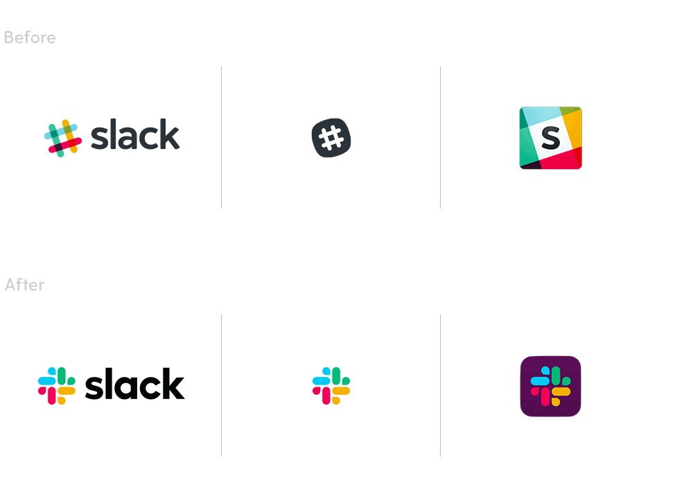
They explain that the new logo is simpler and more scalable. Not too sure about that. Maybe they don't use Slack mobile app themselves. But when I get a notification about a new message, that 3-millimeter icon kinda doesn't even remind me the logo anymore. I see some kind of plus sign with veins. However, it is true that now they will have the logo uniform and consistent along all platforms and all situations. The marketing department will be happy.
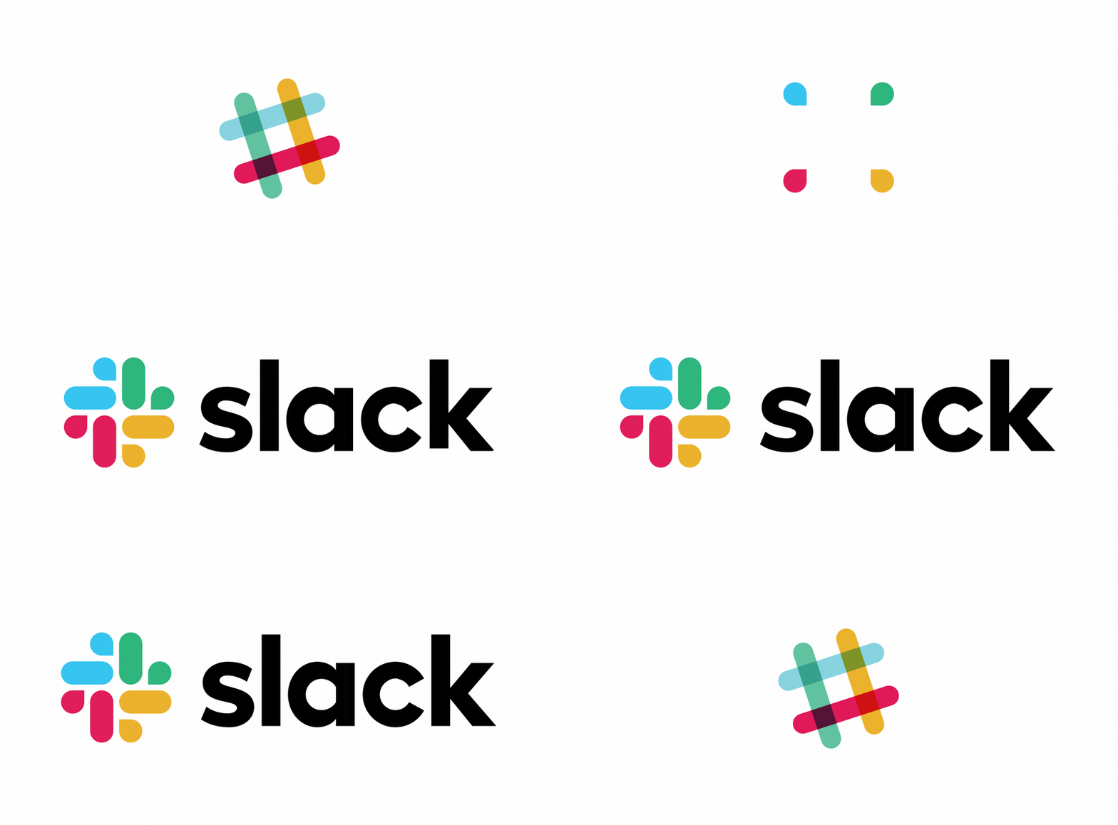
The wordmark is executed nicely and finely which could be expect from Pentagram. Kind of a late-2010s-every-tech-company-bold-sans-serif. I am glad they kept the lower case letters. The sharp edges of the letters work well with the bolder font and smaller distance between the symbols. Really high quality typographic work, even though it's not mind-blowing in any way. What I really dislike is that it does not pal around with the icon at all. They are from different gangs, different cities. That's something that really strikes my eye. Fortunately, I will almost never see them together. So that's an upside.
Slack has already outgrown the startup league and has become one of the main technology players of today. Their record breaking number of users and yearly revenue confirm that as well. And they would like, I assume, to enter the club of grown-up companies with blue-yellow-green-red logos (Hello Microsoft, Google and EBay!). Why else would they chose these colors? By the way, the hues seem quite weird to me and they also don't work equally well with their (even weirder) purple background. The blue and green parts are almost blending and the red and yellow are too bright.
Anyhow, I have a slightly sad feeling about the new Slack style, something like about a mate that we used to discover the most bizarre pubs in town with, roaming around till five o’clock in the morning, and then went to work together to create the coolest apps in the world. And again and again. But now the friend started to wear a tie, go to the office at 8 in the morning and look at me disapprovingly when I tell jokes about genitals. So it goes. Still, Slack won't (hopefully) ban us from using secret channels (God save us from the management knowing about them) with inappropriate jokes and uploading questionable custom emojis. The fact that it now looks a bit like a generic, politically correct company – like in a series about millennials at work – is just the price of its further growth. As it says in one eighties movie about breakfast: When you grow up, your heart dies.
In fact, it's not so tragic at all. So far we have only seen a part of a bigger redesign which Slack plans to roll out in the next months. I look forward to it and I believe that in the new corresponding environment, the logo will work well and everybody will get used to it quickly. I already did.


