How to enable the new Autofill API in Jetpack Compose

Autofill is a convenient Android feature that saves users from repeatedly manually entering data like usernames, passwords, or addresses. Jetpack Compose has not provided native autofill support out of the box until now. In this article, we will show how to use an early API and write our custom modifier if we don’t want to rely on the alpha version of the API.
The early API
The early Autofill API is a part of the Compose UI 1.8 version, currently public in alpha. To try out the new Autofill interface, we have to add a dependency:
androidx-ui = { group = "androidx.compose.ui", name = "ui", version = "1.8.0-alpha06" }and set a feature flag ComposeUiFlags.isSemanticAutofillEnabled to true in onCreate.
Next to the composition – defining our UI, there exists a parallel tree, called the semantics tree. This tree describes our UI in a manner that is understandable for Accessibility services and the Testing framework including the Autofill framework in the latest release. The Semantics tree is automatically populated and generated with relevant data for us.
However, so that the Autofill framework would know what kind of data it should fill in, we need to manually specify the semantic meaning of our autofillable composables via a contentType property through a modifier:
Modifier.semantics { contentType = … }Then we apply the modifier.
TextField(
   value = password,
   label = { Text("Password") },
   onValueChange = { password = it },
   modifier = Modifier.semantics {
       contentType = ContentType.NewPassword
   }
)
That’s it. As you can see, the API is very straightforward. Furthermore, the API also provides a new AutofillManager interface. We can obtain the manager in Jetpack Compose via a composition local – LocalAutofillManager.current. The interface includes two methods commit() and cancel() that help users save newly entered credentials. A common use case is to call the commit() method when we submit a form and the cancel() method when we navigate back and want to ignore the input data.
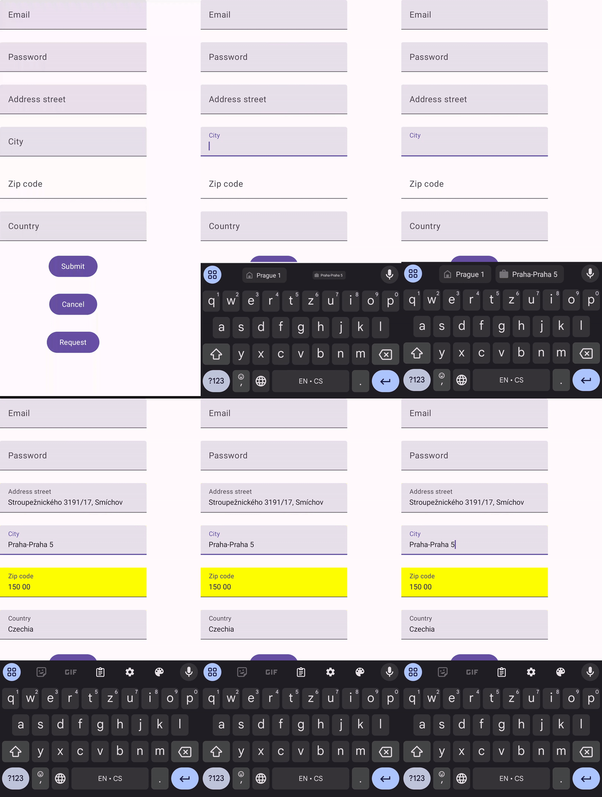
In the XML-based Views system, we were used, that any autofillable field would highlight to indicate when autofill had completed. This feature is also provided in the Compose. We can customize the color through a composition local provider:
CompositionLocalProvider(
   LocalAutofillHighlight provides AutofillHighlight(Color.Red)
) {
...
}
It looks complete now. Let’s show the result!

The Autofill API in Jetpack Compose is an exciting step forward. While this API is still in alpha, it already shows promise for simplifying autofill integration in Compose applications. However, for developers who want to avoid relying on alpha dependencies, creating a custom modifier for autofill is a great alternative. Let’s dive into building a reusable autofill modifier from scratch.
The custom Modifier
Compose requires manual setup using the following APIs: AutofillNode, AutofillTree and Autofill. Let’s describe them first and then combine them into a functional example.
AutofillNode represents a single autofillable field. It is a node in an autofill tree, and we use this node to request and cancel autofill. It holds the onFill lambda which is called by the autofill framework.
AutofillTree, as described in the documentation, is a temporary data structure that should have been used prior to the implementation of the semantics tree. What is important is that we register autofill nodes to an autofill tree. The autofill framework then calls performAutofill method on this tree to populate actual values to its nodes, i.e. our autofillable composables.
Autofill is an interface with two public methods – requestAutofillForNode and cancelAutofillForNode. We call these methods when an autofillable composable function gains or loses focus.
With all the theory behind it, let’s look at the actual implementation.
@OptIn(ExperimentalComposeUiApi::class)
@Composable
fun Modifier.autofill(
   autofillType: List<AutofillType>,
   onFill: (String) -> Unit,
   onReady: () -> Unit = {}
): Modifier {
   val autofill = LocalAutofill.current
   val autofillTree = LocalAutofillTree.current

   var ready by remember { mutableStateOf(value = false) }
   val autofillNode = remember(autofillType) {
       AutofillNode(autofillType, onFill = onFill)
   }

   LaunchedEffect(autofillNode) {
       autofillTree += autofillNode
   }

   LaunchedEffect(ready) {
       if (ready) onReady()
   }

   return this
       .onGloballyPositioned {
           autofillNode.boundingBox = it.boundsInWindow()
           ready = true
       }
       .onFocusChanged { focusState ->
           autofill?.run {
               if (!ready) return@onFocusChanged
               if (focusState.isFocused) {
                   requestAutofillForNode(autofillNode)
               } else {
                   cancelAutofillForNode(autofillNode)
               }
           }
       }
}
There are a few things worth mentioning. We first create the AutofillNode and then add this node to the autofill tree. We use the remember function and LaunchedEffect to add the node only once, even when the modifier would recompose multiple times.
The autofill framework needs to know where to show the autofill popup. We specify the coordinates via the node’s property boundingBox in the onGloballyPositioned modifier. When the composable focus changes, we request or cancel autofill for the node.
The last thing to explain is the variable ready and onReady lambda function. In some use cases, onFocusChanged might trigger before the boundingBox is calculated, which can cause a crash. The flag ready solves this issue. In the onReady callback, we can safely request focus then.
The custom modifier is a useful temporary solution, but after three years of community requests for a native autofill feature in Jetpack Compose, the developers have finally responded. They have introduced a long-awaited solution that you can now try out. Your feedback on the API design would be greatly appreciated.


