We won a tender for a new application for the German Bundestag. Our work is fully in process now and the app will be released in autumn 2018. However, we will introduce some details about the application right now!
How will the app look?
Although the current Bundestag application is still available to download, its technical status no longer meets current requirements. Our task is therefore to replace the app with almost 850 thousand downloads. Due to the significant changes in the user environment, we have designed a completely new application. In summary, we focused on a simple and sophisticated design.
Simplifying navigation
In the current application, a dual navigational system is used, which may be confusing for users during the crawl process, so we have designed a clear and uniform layout of information tabs in the lower bar across the application. Thus, the environment is consistent and our users know exactly what section they're in.
Modern Design: Information first
In terms of graphic design, some points have been clearly required by the Bundestag. The icon of the application must be (same as the current application’s) a symbolic eagle. The modern look has to be based on the corporate design of the Bundestag so that the application would represent the integrity of the German government. According to the outcome of the tender, we have obviously succeeded in this - completing our main objective or presenting the German Bundestag in a modern world of applications with dignity.
But how did we achieve it? We followed a simple rule: "Information first."

We paid great attention to typography, we used as few decorative elements as possible, we drew the icons in a uniform style and used them only when necessary.
In order to maintain text readability and a clear look, we selected only two types of fonts for the entire application, and the right shades, cuts and line heights.
The selected colors correspond with the Bundestag manual and its current website. We used orange accents very carefully, to keep the app serious but fresh looking. The informative character of the application is supported by the predominant black and white color. It was important to work with free space to create easier orientation within the app and to prevent the flood of text and data. The application looks fresh even though it contains a lot of information.
The selected color system has helped build a clear and consistent UX application, and thanks to this, the users always know where they are, where to continue and how to get back while clicking a specific button.
What features will the app offer?
The application includes 4 main sections:
- News from the Bundestag
- Plenum: online streaming from meetings
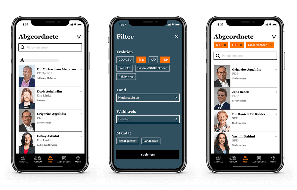
- Lists of Members and their details
- Committees, their programs and news about them
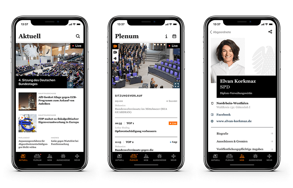
An icon for each section is placed on the bottom bar (see the screenshot) which is always visible and can be used as the main landmark. The fifth icon in the bar, labeled Mehr, contains other less often used features (settings, saved articles, app details).
In the News section you can find voting results, seat repartition and meeting schedules.
The most attractive feature is the live broadcasting from the Bundestag. The Plenum section is dedicated to online broadcasting, but if the meeting is going on at the moment, the user sees the broadcast preview also in the News section. This online image will be labeled LIVE and accompanied by a button providing access to the Plenum section. If the user is in a different section when the live broadcast begins, a red notification ring appears on the Plenum icon on the bar to inform them about the broadcast.

The Plenum screen is dominated by stream screens. You can choose from two video and one audio channel. For comfortable viewing, the video can be switched to fullscreen and you can watch it in landscape mode. Under the screens you can find a streaming program with attached content of each meeting, a list of personal speeches and discussions. The currently discussed point is highlighted in color and automatically scrolls over the live broadcast. The program can also be scrolled during the broadcasting - the video image is anchored at the top of the screen, so you can read the program and watch the session at the same time.
During the app designing process we are aware of further development, so basic functions are prepared to be extended in the future, according to the client's new wishes.
How will the development go?
We will develop the application natively in full quality because we are good at it and it has always worked for us. At the same time, we don't want the new application to use webviews. We want it completely independent on the Bundestag website. It will be available for iOS and Android platforms and fully compatible with common types of smartphones and tablets. During development, we want to focus on speeding-up the app in order to avoid slow loading of photos or items in the lists.


